

ONS ghosts Part 2: How many "ghosts" die with covid?
Findings of the "ghost" analysis on covid deaths

In my last post I explained that there is a population who are not included in the ONS deaths by vaccination status sample who I refer to as the ghost population. This population has a lower all cause mortality rate for the unvaccinated and a higher rate for the vaccinated.
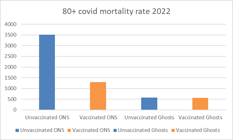
Here I have repeated the analysis for covid deaths. The ONS have omitted a figure for the “ever vaccinated” by age for their data and the deaths by subgroups are often reported as <3 in the younger age groups. This makes analysis impossible for younger age groups so I have restricted analysis to the over 50s.
The results are totally different to the findings for all cause mortality. The ghost population has a lower covid mortality rate for the unvaccinated but also for the vaccinated. This makes the hypothesis of human bias (i.e. a bias introduced by people who were aware of the vaccination status before making subjective decisions on whether similar records counted as a match) that I put forward in my last post unlikely.
What is the ghost population?
The ONS have released data on a sample of the population providing data on deaths and population size by vaccination status. The sample includes those who matched a census record and a record in the vaccination database. Separately, they have provided death data for all matches in the vaccination database (table 5). The difference between the whole population and the population in the ONS sample I refer to as the “ghost population.” (See more detail here).
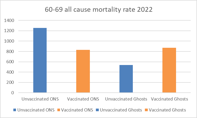
To simplify the issue I looked at the total mortality for all of 2022 (using the average of the population in each group over the period).
Here are the results for all cause mortality in 2022. In almost every case, as we saw before, the ghost all cause vaccinated mortality rate is higher than the ONS all cause vaccinated mortality rate and the ghost all cause unvaccinated mortality rate is lower than the ONS unvaccinated all cause mortality rate.


The same charts for the covid mortality rates are very different. For all cause mortality the deaths in unvaccinated ghosts are underrepresented whereas deaths in vaccinated ghosts are over-represented. For covid mortality both unvaccinated and vaccinated ghosts have an apparent under-representation of deaths.


My thoughts on why this should be are included in the next post.
In the meantime here are the covid mortality graphs per month by age group.
Thanks for these analyses Clare, very interesting.
You can fill in the covid deaths in the younger age groups by subtracting the non-covid deaths from the all cause deaths in table 2. Don't use table 4 as there are more unknowns because of the male/female split. So if all cause deaths for an age group and month are 14 and non-covid deaths are 13, you can replace the <3 covid deaths with 1.
This leaves some <3 figures left but you can make guesses of these by looking at neighbouring months and comparing person years and deaths in these. Many are likely to be zero. The guesses aren't that material as long as your estimate is remotely sensible.
Should be possible to do 18-39 and 40-49 age groups as a result.
Thanks for these interesting analyses as well!
If I'm not mistaken then there's a little error in your summary introduction.
Starting with a little nitpicking: it looks to me that you show not the average but the totals of each group over 2022 (basing myself on your monthly graphs for 70-79 in your earlier article). Correct?
In the 80+ all cause mortality graph for 2022, there the yearly totals don't seem to match your monthly rates, for example vaxed ONS av.800x12= ca.10'000/yr whereas your graph shows 20'000/yr.