ONS Ghosts Part 3: The ONS have a faulty sorting hat
A failure to match vaccine records can explain mortality anomalies


In the last two posts I analysed the all cause and covid mortality rates by vaccination status for the
whole population,
the ONS sample and
those not in the ONS sample - the “ghost” population.
The all cause mortality rate was higher for the “ghost” vaccinated population than the ONS sample and lower for the “ghost” unvaccinated population than the ONS sample. However, the “ghost” covid mortality rate was lower than the ONS sample regardless of vaccination status.
The key to this discrepancy must lie in a difference between covid and all cause deaths. What is different about covid deaths? One striking difference is the proportion that occurred in hospital. For 2022, 44% of all deaths and 71% of deaths involving covid occurred in hospital. The 44% figure might seem intuitively low but in fact 28% of deaths happen in the person’s own home and 21% in care homes with the rest in hospices or elsewhere.
If a hospital death is more likely to be accurately linked to an NHS record then these two factors could be enough to explain the discrepancies seen both with all cause mortality and with deaths involving covid.
To illustrate how just those simple differences could play out I am going to create a hypothetical example and walk you through it. Imagine a population where everyone had the same mortality rate for all cause deaths and deaths involving covid. In this hypothetical scenario vaccination does not actually affect the chance of dying. However, it could be an indicator of how likely it is you would die in hospital. The fact that 28% of deaths occur in care homes has interesting implications. Many care homes require covid vaccination as a condition of being a resident. The result is that unvaccinated deaths are unlikely to have been in care homes and therefore proportionately more likely to have occurred in hospital.
I am not saying this is what happened, only showing that it is possible to have markedly different mortality rates for different groups thanks only to differences in data matching and hospitalisation rates. I am also not saying this is the only way such a misclassification could have occurred. The point is that there are many ways where differences between groups could affect the accuracy of linking and give the same result.
The key problem that leads to the different mortality rates was summarised by Sarah Caul, Head of Mortality Analysis at the ONS. Any death that could not be matched to a vaccine record was assumed to be a death in an unvaccinated person:
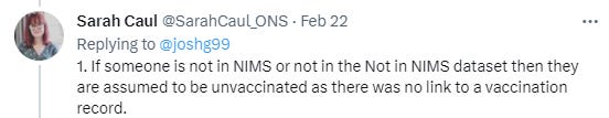
A small fraction of deaths in the vaccinated population which fail to match a vaccination record will have a small, but important, effect on mortality rates in the vaccinated population, making them artificially low. However, because the unvaccinated population is smaller, that same small number of misclassified deaths will have a greater impact on the mortality rate for the unvaccinated.
The assumptions made in the analysis that follows are listed below. I put the assumptions where I have minimal evidence to inform them in italics. The others are reasonable for an older population and based on good evidence.
Here are those assumptions:
Actual all cause mortality is 1% and covid mortality is 0.1% for all groups
90% of the population are vaccinated
The ONS sample includes 90% of the vaccinated and 30% of the unvaccinated population
100% of deaths that occur in an NHS hospital have a death certificate that is successfully linked to an NHS number resulting in correct assignment of vaccination status
80% of deaths that occur outside of hospital have a death certificate that is successfully linked to an NHS number resulting in correct assignment of vaccination status
N.B. See post script addition for how the same findings can be seen with an assumption of 95% matching in hospital deaths and 94% in out of hospital deaths.
The final assumptions are what proportion died in hospital. The exact proportion is something I don’t know.
Here are the proportions I used in the illustration:

I will take you through the sums below. The result is a similar picture as was seen in the real data:
The ghost unvaccinated have a much lower apparent all cause and covid mortality than the ONS unvaccinated
The ghost vaccinated have a much higher apparent all cause mortality and much lower covid mortality than the ONS vaccinated
These findings were seen even though the actual mortality rate for each group was identical.
Let’s start with the whole population and assume we have 1 million people. 900,000 are vaccinated and the mortality rate for all groups is 1% so there will be 1000 deaths in the unvaccinated and 9000 in the vaccinated.
Of the 9,000 deaths in the vaccinated 3915 happened in hospital and were correctly matched to an NHS number. However, 5085 happened out of hospital and for 20% of these, 1017, the match to an NHS number failed. These deaths were therefore incorrectly assigned as being deaths in the unvaccinated.
Rather than the actual 9,000 deaths in this vaccinated population only 7,983 were considered to be vaccinated deaths bringing their mortality rate down from 1,000 to 887 per 100,000 people.
In contrast, the 1,017 deaths in the vaccinated that could not be matched to an NHS number were added to the total for the unvaccinated such that it was believed that 2017 of the deaths were in the unvaccinated making their all cause mortality rate 2,017 per 100,000. An illusion of a mortality rate that is more than twice as high in the unvaccinated can be created in this way

.
Table 1: All cause mortality per 100,000 for whole population calculated using assigned vaccine status. The orange cells are added to give the orange deaths assigned as unvaccinated and the green cells give the green total deaths assigned as vaccinated.
Of this whole population only a fraction is represented in the ONS sample: 90% of the vaccinated and 30% of the unvaccinated. The same sums can be repeated for this subpopulation. For the vaccinated, the resulting supposed mortality rate is even lower than for the population as a whole and the rate for the unvaccinated is twice as high as for the population as a whole.

Table 2: All cause mortality per 100,000 for ONS sample population calculated using assigned vaccine status. The orange cells are added to give the orange deaths assigned as unvaccinated and the green cells give the green total deaths assigned as vaccinated.
Finally, we can see what the rates are like for the remaining population - the ghosts. The deaths that were not matched to the ONS population were assigned to this ghost population by default. The calculated mortality in the unvaccinated and vaccinated groups is now closer but still has the illusion of being worse in the unvaccinated.

Table 3: All cause mortality per 100,000 for “ghost” population calculated using assigned vaccine status. The orange cells are added to give the orange deaths assigned as unvaccinated and the green cells give the green total deaths assigned as vaccinated.
Covid mortality
A similar model for covid mortality produced results that also aligned with the anomalies seen in the earlier analysis. Again the actual mortality rate was constant for every population at 0.1%. However, with 20% of out of hospital deaths not being matched to an NHS number
Based on these assumptions I could not replicate the finding of an all cause mortality rate in the ghost vaccinated population that was higher than the unvaccinated population. However, the other anomalies were replicable with these simple assumptions of mismatching.
Even with only a 6% difference in hospitalisation rates between the vaccinated and unvaccinated, the calculated covid mortality rate appears markedly worse for the unvaccinated after the misclassification.

Table 4: Covid mortality per 100,000 for whole population calculated using assigned vaccine status. The orange cells are added to give the orange deaths assigned as unvaccinated and the green cells give the green total deaths assigned as vaccinated.
Once only the proportion included in the ONS sample is included in the calculation the difference becomes even more stark.

Table 5: Covid mortality per 100,000 for ONS sample population calculated using assigned vaccine status. The orange cells are added to give the orange deaths assigned as unvaccinated and the green cells give the green total deaths assigned as vaccinated.
Again, the deaths in the ghost calculations are the default difference between the whole population and those in the ONS sample. Although the calculated mortality rate for the ghost population remains artificially higher in the unvaccinated it is lower than for the ONS sample and overall population for both the vaccinated and unvaccinated groups.

Table 6: Covid mortality per 100,000 for “ghost” population calculated using assigned vaccine status. The orange cells are added to give the orange deaths assigned as unvaccinated and the green cells give the green total deaths assigned as vaccinated.
Below is the same table as above. In brackets I have included the range of percentages where, keeping all the others constant, the same discrepancies appear in the data. At the extreme ends of these ranges the proportions hospitalised in the ghost population near zero or 100% or the ranking of groups by mortality rate changes order. The last two rows include the resulting hospitalisation rates in the ghost population for the figures used in the illustration.

I do not claim to know what proportion of deaths were mismatched. All I have done is illustrate that mismatching alone can create extreme differences that fall into the same pattern as is seen in the data provided by the ONS. The only anomaly that could not be replicated was having significantly higher ghost vaccinated mortality than unvaccinated mortality as was seen in 2021.
To pursue this further there are a series of questions I shall be asking the team at the ONS:
What proportion of deaths in the vaccinated and unvaccinated populations occurred in hospital both for the population as a whole and for their sample?
What proportion of deaths in hospital could be matched to a record in the vaccination database (NIMS)?
What proportion of deaths that did not occur in hospital could be matched to a record in the vaccination database (NIMS)?
Post Script
A comment from Freecumbria alerted me to the fact that the ONS claimed a 94.6% matching rate between the census and NHS numbers.
https://drclarecraig.substack.com/p/deaths-among-the-ghost-population/comment/13137073
That does not tell us the rate between death certificates and the vaccination database.
However, even a high matching rate like that does not change the outcome. I reran the numbers. With a matching rate of 94% out of hospital and 95% in hospital it still works. The mortality rates were:

You have to wonder what they were doing for 7 months while waiting for the 2021 census data? Obviously not working on the integrity of their analysis. Perhaps, they were busy finding other ways to hide the signals that the jab is really, really bad?
I asked the ONS simply to publish the underlying data. They claimed privacy reasons. I said, "here's how to get around that." They stopped responding to me at that point. I guess that is how science works.