ONS ghosts Part 1: Deaths among the ghost population
Analysis of ONS deaths by vaccination status data
This article has been edited - see note at end.
As always in the last two years we can learn more from what is not said and what is not included in data than from what is presented. The key to the analysis I am going to present is looking at the population who are not included in the ONS sample, which I am calling “the ghost population”.
The ONS have reported on deaths in a sample of the population which they claim is representative of the population. However, a comparison with the whole population and with the ghost population demonstrates a significant bias. Deaths in the unvaccinated are overestimated compared to the whole population and deaths in the vaccinated are underestimated.
If the ONS sample was not biased, then there would be a similar mortality rate in
a) their sample,
b) the whole population and
c) the ghost sample.
There may be lower confidence in mortality calculations based on estimates of the unvaccinated population size as the size of this population can only ever be an estimate not a measurement. However, the same cannot be said for the vaccinated population where records have been kept of each person vaccinated. Even for the measured vaccinated population the mortality rate differs within the ONS sample and in the ghost population. Several people have defended the ONS figures and claimed that the population estimates provided by UKHSA in their vaccination database are more flawed. This criticism is invalid. Younger age groups, where the discrepancy between denominators is largest, have seen a convergence of recent mortality rates regardless of the denominator used - implying they are all in fact accurate. The demonstrable bias in mortality rates might be due to issues with how people are matched between datasets and the biases of anyone doing manual matching.
Background
After a seven month hiatus the ONS have finally released data on deaths by vaccination status. The ONS have concluded that there is a huge difference in all cause mortality rates between the unvaccinated and vaccinated with around 50% more deaths per 100,000 people for the second half of 2021. It is an extraordinary claim and deserves a closer look. After all, the saviour vaccine (even if it could reduce covid deaths) is not the elixir of eternal life.
Figure 1 ONS of age standardised mortality rates for unvaccinated and vaccinated from their latest data release
An important clue came from eagle eyed @OS51388957 who noticed that there was a significant difference in deaths in Table 5 of the data compared to the other tables. I asked Sarah Caul who leads the mortality team at the ONS why there was such a discrepancy between the tables and received this reply:
The ONS have provided data for the whole population in table 5 and data for their sample in the other tables.
How do you become a ghost?
When someone dies then a number of tests were carried out to determine if they were a ghost.
Were they in the 2021 ONS census? If not, then they are a ghost.
Could the ONS census entry be matched to an NHS number? No? - they are a ghost
Was there more than one NHS number? Yes? - they are a ghost
To be an ONS sample death all of the following documentation must match exactly:
Death certificate
NIMS record (through a matching, single NHS number)
ONS census data
However, to be an ONS sample person in the population denominator only the following documentation must match:
NIMS record (through a matching, single NHS number)
ONS census data
The kinds of people most likely to end up as ghosts are those who did not complete the census forms, those with names where spelling can vary such that matching may not have been possible, and people using a different name on the census to the one on their medical record. You could be in all the datasets and still be a ghost because of matching problems.
The problems with matching should not be underestimated and are highly subjective. Let’s say there was a person called Kate Al Khabib born on 1/7/85. Would you match a record with the name Katherine? What about if the surname was spelled Al Kabib or Al Khahib or even Al-Khabib? What if the date of birth was entered the American way as 7/1/85? Even if the majority of the matching is automated there will be grey areas like this where decisions need to be taken by humans.
Every mismatch is an opportunity to be misclassified and there will therefore be bias towards a higher proportion of ghost deaths (with three opportunities for a mismatch) than ghost population (with only two opportunities) - but this will be true regardless of vaccination status. The ONS methodology uses the cryptic phrase “We linked deidentified Census 2021 records to NHS numbers using the personal demographics service to obtain NHS numbers for census identification numbers.” How does one link a deidentified record i.e. one with no identifying information? That’s beyond me.
How many ghosts are there?
There are two types of people that were not in the ONS sample:
People who are registered with a GP and are resident in the country (recorded in the UKHSA NIMS vaccination database) who are not included in the ONS census data.
People in the census who were not successfully matched to an NHS number. These totalled 3.8 million or 8.4% of the census population.
UKHSA NIMS database measure (people registered with a GP and resident in the country) of the English population over the age of 5 years is 59.5 million. That is quite a contrast to the 53.4 million recorded in the 2021 census. The UKHSA dataset does not claim to be a comprehensive measure of the whole population and with every covid wave there have been a significant number of “unlinked” covid cases from people not even in that system. However, any people that exist outside of the vaccination database do not count as ghosts in this analysis as it has been restricted to the data provided by ONS which matched the vaccination database. Figure 2 shows the size and vaccination status of the different population measures.
Figure 2: Graphic of the distribution of different measures of the population
The ONS claim to have included only 40.8 million adults in their sample where census and NHS number data matched. Compared to all the over 18 year olds included in the NIMS vaccination database there is a good representation of vaccinated people in the ONS sample but only a small fraction of the unvaccinated are represented.
The difference between the population estimates really matters because people who die turn up in records but when people are alive they can remain hidden from the records. There is therefore a bias towards inflating a mortality rate (fraction of deaths over population) by not including the entire population in the denominator.
In theory, having an ONS sample with underrepresentation of the unvaccinated would not matter if the numerator (i.e. the number of deaths) was right because the aim is only to look at what proportion of a population are dying. If the sample from one population is not as large a proportion as from another it would not matter once the fractions were calculated so long as the sample was representative of the population. But was it?
Was the ONS mortality rate representative?
It is possible to check whether it was representative of the population by comparing three different groups:
Deaths within the ONS sample population
Deaths in the whole population using the NIMS denominator
Deaths in the ghost population (subtracting 1 from 2)
Let’s start with the vaccinated. There is no reason to expect a discrepancy in the mortality rate between these groups. The vaccinated are a measured population and unless there is significant bias in one set of data, the mortality rates (deaths per 100,000 people) should be the same.
There are differences in how a denominator for a mortality rate can be calculated. The ONS uses the number of vaccinated people per day calculated over the whole month as a value called person-years. This allows for a fair calculation in a month when people are being vaccinated and the values change each day. Because we do not know the days of death or vaccination for those in the NIMS data, the denominator for a NIMS mortality has to be the total number of people who were vaccinated. I used mid-month values for each month. During a month when vaccines are being rolled out the NIMS total of people vaccinated may be very inaccurate. For example, if everyone was vaccinated at the end of the month the number of people would be large but the number of days for which there were vaccinated people would be relatively small. In order to compare the two measures a mortality rate per person was calculated for both NIMS and ONS samples. This meant reverse engineering the ONS person-years data to give the average number of people vaccinated in that month (see appendix for methods). To calculate the ghost population this this value was subtracted from the total NIMS population for each age group in each month.
For the younger age groups the mortality rate in the vaccinated ghost group was astronomical when calculated using the number of people in NIMS in the middle of the month. Therefore, the number of people at the end of the month was used for April, May, June and July for the 18-39 year old age group and for April and May for the 40-49 year old age group. This was the most generous denominator possible which should give the smallest possible mortality rate. It is essentially assuming that every person vaccinated that month was vaccinated on the first day of the month. The true mortality rate must be higher than that shown in the graphs for these age groups for those months. Ideally more granular data would enable examination of deaths in this period.
Figure 3: Mortality rate per 100,000 people for the vaccinated 18-39 year olds, purple = ONS sample; pale blue = whole population; orange = those not included in ONS sample
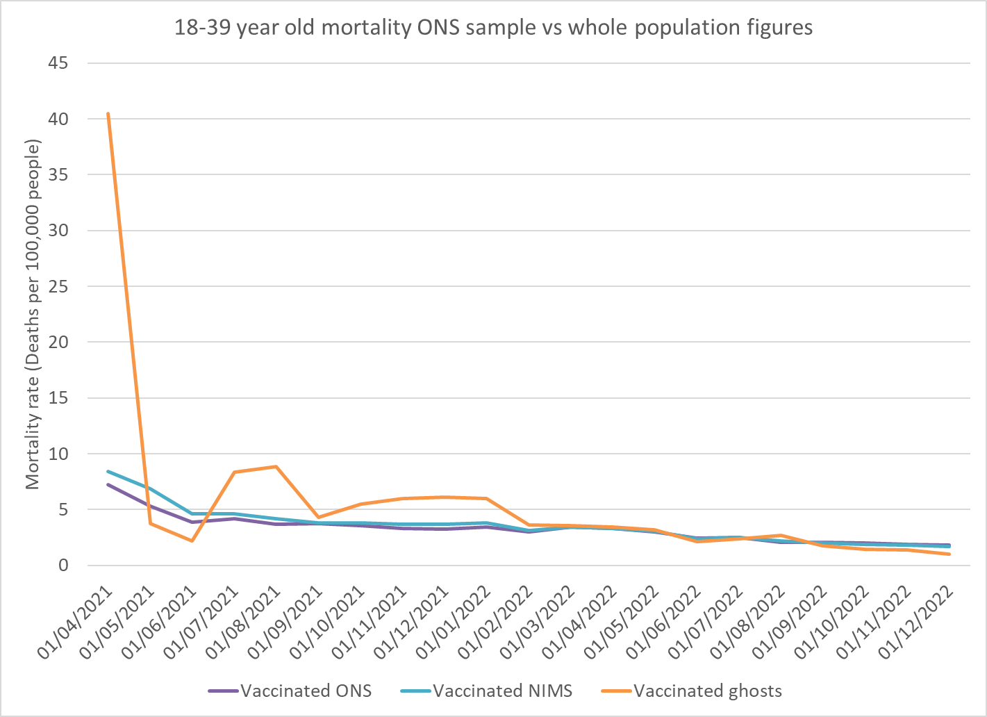
The first point in the ghost population is so high, even with the largest possible denominator, that it obscures the relationship between the other rates. Figure 4 (below) shows the same graph with a different scale on the y-axis.
Figure 4: Same as figure 4 but zoomed in. Mortality rate per 100,000 people for the vaccinated 18-39 year olds, purple = ONS sample; pale blue = whole population; orange = those not included in ONS sample
The ONS used data by the date when the death occurred and there is a lag in the numbers, particularly in younger age groups where deaths are more likely to have lengthy investigations before being registered and entered into the data. The drop in mortality rate for all groups in the second half of 2022 is likely due to this lag not a real finding.
At the start of the vaccine rollout only the most at risk 18-39 year olds were eligible for vaccination so the high mortality rate in this cohort should not come as a surprise. It is hard to know quite what mortality rate should be expected in that period. What is a surprise is that the deaths were disproportionately attributed to the ghost population and not those in the sample.
In May and June the denominator for the ghost population may be overinflated from taking the value at the end of the month. In July this age group became eligible for vaccination regardless of health status. From July 2021 until after the third dose campaign a disproportionate number of deaths in this age group were in the ghost population.
Figure 5: Mortality rate per 100,000 people for the vaccinated 40-49 year olds, purple = ONS sample; pale blue = whole population; orange = those not included in ONS sample
A high mortality rate in April is notable for the 40-49 year old age group in all groups. Again this likely reflects those at highest risk of dying being the only ones eligible in that period. However, the proportion in the ghost population is extreme. From June the proportion of deaths in the vaccinated in the ONS sample was significantly lower than the ghost population. The number who were not matched was small and accounted for the small difference between the purple and pale blue lines in terms of the impact on the total population mortality. However, there does appear to be a significant bias in terms of which deaths are successfully matched to census and NHS numbers by the ONS and which are not. Why should vaccinated people who were not matched to records have a mortality rate double those who were matched?
With no adjustment to the denominator the mortality rate for the 50-59 year old ghosts is 1,354 in April 2021. April has therefore been omitted from the graph below.
Figure 6a-d: Mortality rate per 100,000 people for the vaccinated, for over 40 year olds, by age group, purple = ONS sample; pale blue = whole population; orange = those not included in ONS sample
A similar pattern of a bias in deaths that were excluded from the sample was seen in 50–59 and 70-79 year old age groups. The matching for the 60-69 year old age group is much better.
The data for the over 80 year olds is rather odd. The ghost population has a much lower mortality rate. This could be caused by a low number of deaths or by a high number of people in the denominator. The measure of who was vaccinated in this denominator is not an estimate so should not be higher than reality. Could the denominator be too large in the ghost population because of erroneous records of vaccinated people? Has the UKHSA NIMS data lagged behind in removing the records of dead vaccinated over 80 year olds - but in a constant way over time? Perhaps there really is a population of geriatrics so healthy that they have never interacted with the healthcare system (except to get a vaccine) and have no NHS number or so rebellious that they fail to complete census forms. These apparently rebel grannies and grampas have a mortality rate half of their contemporaries. They account for 1 in 15 deaths in that age group so they are not an insignificant population. The discrepancy warrants further investigation.
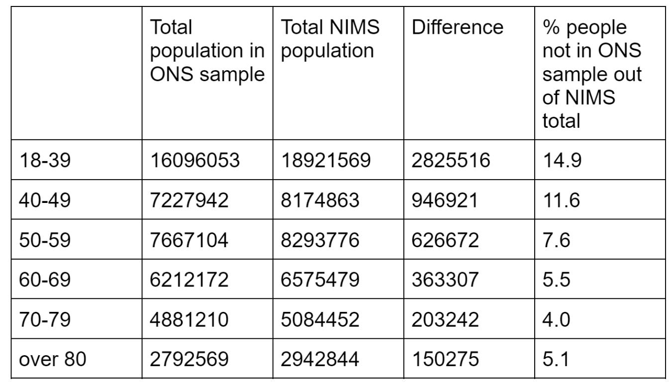
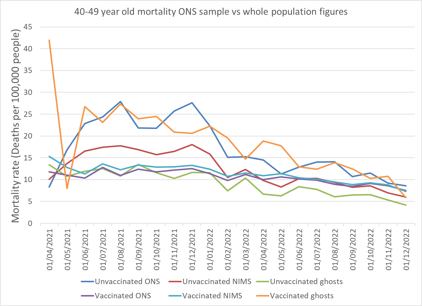
What about the unvaccinated? The ONS claim that the NIMS vaccination database overestimates the size of the population, especially in younger age groups (see table 1). If they were right, that would mean that the NIMS mortality rate for the unvaccinated would have a denominator that was too large. If they were right, the unvaccinated mortality rate would be artificially low - especially in the younger age groups where the discrepancy is largest. The same is true for the mortality rate for the ghost population which is calculated based on the NIMS figure (green line in graphs below). If they were right the green lines (ghost mortality rate) would be much lower than the blue lines (ONS mortality rate) particularly in the younger age groups.
Table 1: Total population in ONS data (see appendix for calculations) compared to NIMS data from end November 2021
The following graphs add in two further lines for the unvaccinated in each group.
Figure 7: Mortality rate per 100,000 people for the vaccinated and unvaccinated, 18-39 year olds purple = vaccinated ONS sample; orange = vaccinated but not included in ONS sample; mid-blue = unvaccinated ONS sample and green = unvaccinated but not included in ONS sample.
It is notable that the estimates for unvaccinated and vaccinated mortality rates for the ONS and ghost population all converge at the end of 2022 for the age group where there is the largest discrepancy in estimates of the size of the population. If the NIMS data included many people who were not actually in the country any more, as has been claimed, then the mortality rate for the unvaccinated NIMS population would remain, artificially much lower than for the ONS population. The fact they converge suggests that both measures are approaching the same fraction with deaths attributed to an appropriately sized population in each case. This is good evidence that the NIMS population estimate is indeed accurate and that there was no bias in death allocation between those included and excluded from the ONS sample in that period.
However, in 2021, there is a bias. The mortality rate should be the same for the unvaccinated in the ONS sample and the ghost population. Instead those in the ONS sample had a markedly higher mortality rate than the ghost population. It is also worth noting that the highest mortality rate was seen in the vaccinated ghost population (orange).
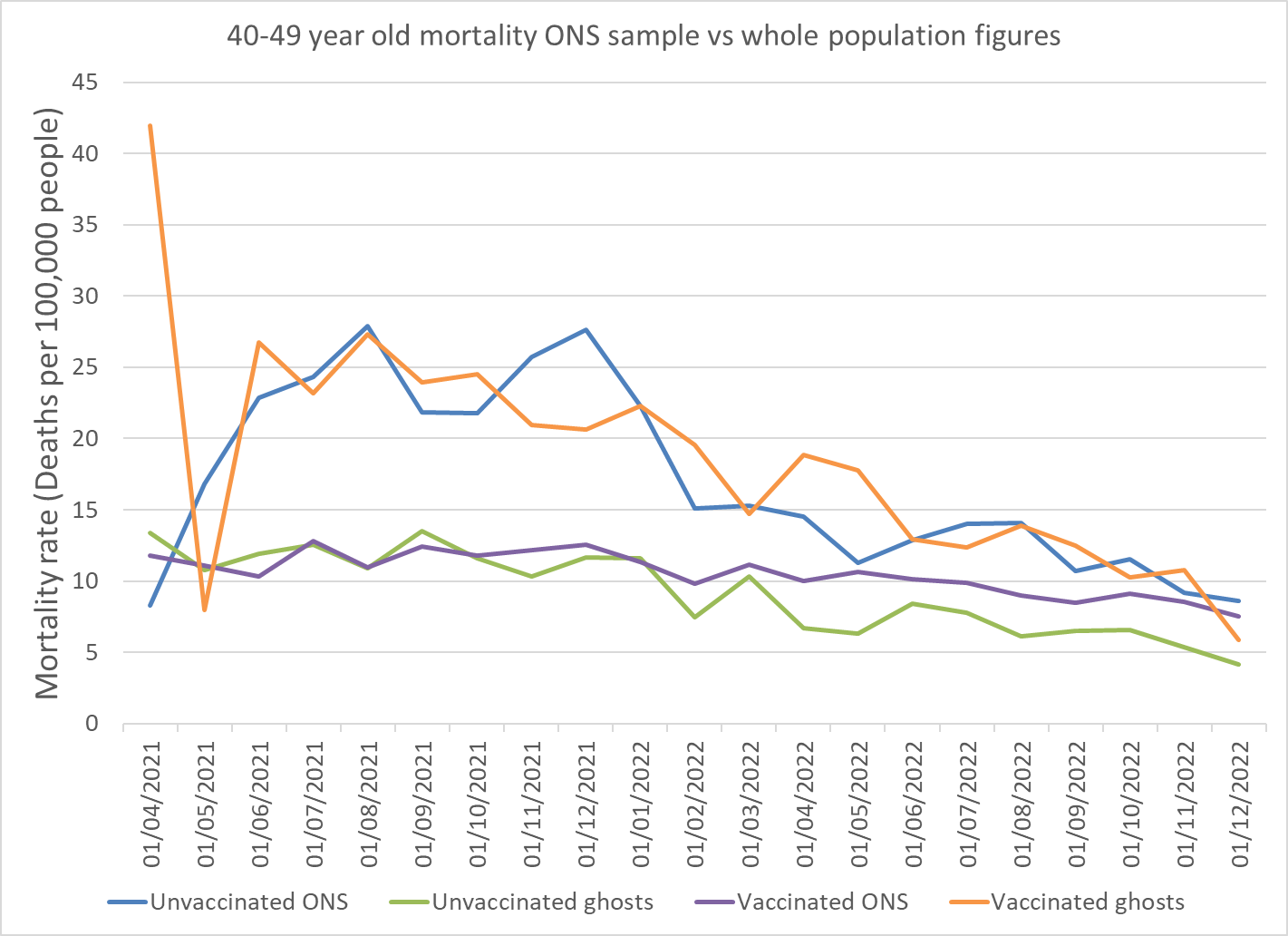
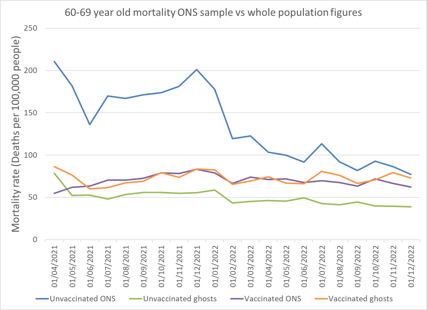
For all the older age groups there is a clear bias. For those included in the ONS sample the blue line is always above the purple line which indicates a higher mortality in the unvaccinated than the vaccinated. However, for the ghost population the orange line is always above the green line indicating a higher mortality in the vaccinated than the unvaccinated. If, as some have claimed, NIMS overestimates the denominator (e.g. by including people who have left the country) and the ONS population estimate is closer to reality, that could explain the lower unvaccinated mortality rate but it cannot explain the higher vaccinated mortality rates.
For the 40-49 and 50-59 year olds it is particularly striking that the mortality rate for the unvaccinated ONS population in the sample matches that for the vaccinated ghost population and vice versa.
Figure 8a-e: Mortality rate per 100,000 people for the vaccinated and unvaccinated, by age group, purple = vaccinated ONS sample; orange = vaccinated but not included in ONS sample; mid-blue = unvaccinated ONS sample and green = unvaccinated but not included in ONS sample.
The accusation of an inflated NIMS population does not hold up. The convergence seen in younger populations in recent months in the mortality rates for the NIMS and ghost population suggests that the population estimates are accurate. If the NIMS population figure was genuinely too large then the mortality rate should continue to be lower by the NIMS measure than the ONS measure. It was the younger populations where there was the largest discrepancy and yet it is the younger age groups where they have converged.
Having excluded a problem with the population denominator that leaves a problem with how deaths were allocated to each group. Previous analysis on the ONS deaths by vaccination status data demonstrated that there was a bias towards lower mortality rate for the population included in the ONS sample and those in the ghost population. This was particularly acute for the period two weeks after vaccination The more recent data seems to have bias such that deaths in the unvaccinated are more likely to be included in the ONS sample whereas deaths in the vaccinated have the opposite bias and are more likely to be excluded from the ONS sample. The result is a huge difference in all cause mortality which makes the vaccines look like the elixir of eternal life that some want it to be. It is hard to see how or why it has happened. Whatever the reason for it, it obviously makes the reported death rates biased and unreliable.
If these population estimates are indeed accurate, this raises an important question as to why the mortality rates vary. Have deaths in the unvaccinated been somehow shoehorned into the ONS sample when the people dying were actually in the ghost population? Has doing this artificially raised the mortality rate of the unvaccinated population within the ONS sample? Similarly, is there a bias which has led to deaths in the vaccinated being more likely to be excluded from the ONS sample? How much matching of records was done manually? The most fundamental question of all is whether any people trying to match identifying details in different datasets were aware of the vaccination status of the person who had died when they did that?
For an equivalent analysis on covid deaths see Part 2
For thoughts on how the bias occurred see Part 3
Appendix
The population figures by age group for the ONS data were calculated from table 4. The person-years were converted into an average number of people by multiplying by 365 and dividing by the number of days in that month. The total for the unvaccinated was subtracted from the total for the whole age group to give a figure for the vaccinated. All entries for <3 deaths were assumed to be 2 deaths.
For completeness I have included the graphs with the mortality rate for the whole NIMS population for comparison.
Figure 9a-f: Mortality rate per 100,000 people for the vaccinated and unvaccinated, by age group, purple = vaccinated ONS sample; pale blue = vaccinated whole population; orange = vaccinated but not included in ONS sample; mid-blue = unvaccinated ONS sample; red = unvaccinated whole population and green = unvaccinated but not included in ONS sample.
Edit:
I had used a value of 63.4 million over 5 year olds in the NIMS database which is reported here: However, I used the NIMS spreadsheet data which estimates the total at 59.5 million. I have corrected the article to use the latter number.










I love the idea of rebellious old folk, swerving the system for their whole life, and living longer as a result!
Many thanks for this detailed analysis. I must ask a question regarding this point: "The most fundamental question of all is whether any people trying to match identifying details in different datasets were aware of the vaccination status of the person who had died when they did that?"
Taking into account that ONS refused to provide any data for seven months and then returned with data arranged into new categories that do not line up helpfully with the historical data, the most parsimonious explanation appears to be that ONS are intentionally gerrymandering the data. What I still do not quite understand is why they would do this - they are not funded from pharmaceutical money like The British Heart Foundation, who have a fiduciary motive for their deceit, and they cannot protect the government from criticism because the 'opposition' party is even more rabidly pro-magical talismans than the government and wouldn't dream of calling them on this topic.
What motive do the ONS have to be purposefully distorting the presentation of this data? A few candidates are worth mentioning:
1. ONS contains a sufficient number Covidian true believers who are certain the vaccines work and thus consciously or unconsciously skew the data towards the result they expect or want
2. ONS is afraid of causing confidence in vaccination to slip even further than the recent nonsense already did, and is therefore intentionally engaging in a pernicious 'noble lie'
3. There is pressure on the ONS from somewhere else (where...?)
I suspect this is more of a question for the other people loitering in the comments than for you, Dr Craig. However, let me take the opportunity to thank you for everything you have been doing since 2020. It is greatly appreciated!