Yesterday I posted on the fact that excess mortality in US states has become more predictable from one state to another. Here I present a more refined method for producing the baseline having thought hard about the findings and sought advice from trusted colleagues.
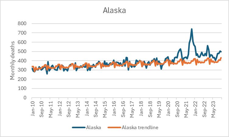
I am conscious that the graphs I shared of Wyoming and Alaska look like the trendline is simply too low. Perhaps they have had exceptional population growth lately? Perhaps they have a rapidly ageing population? Is it a poor baseline that is resulting in consistently high excess in certain states and consistently low excess in others? That is possible, but the states with moderate excess tell a different story.
Here are some further examples where the baseline is correct for periods of 2023.
If we remove the 10 states with the highest and lowest excess from the calculation in 2023 we still see a very high R squared value.
I have asked for thoughts on the previous piece from trusted colleagues. Scott McLachlan (@LawHealthTech) suggested I use a more refined baseline and check. I therefore used this methodology.
I took the monthly deaths as a ratio of the previous month’s from 2010 to 2019. Dan (https://x.com/RuminatorDan suggested I use a geometric mean to work out the monthly average ratios).
For each month I used the geometric mean of this ratio to give the granularity of the seasonal increase and for projecting it.
Here are the graphs using this method.
The findings are the same.
For all the graphs below the % excess in the earlier period is on the x-axis and the % excess in the later period is on the y axis.
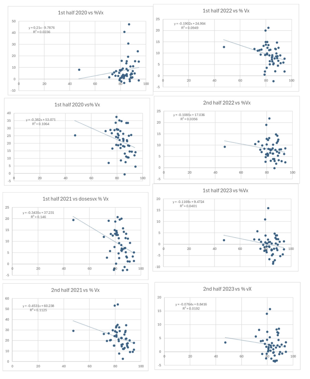
The next graphs show the % excess against the% of over 65 year olds vaccinated at end 2021. In every case % excess mortality is on y-axis and % vaccinated on x-axis. There are no statistically significant relationships here.


I love the picture you chose! Perfect. Thank you for checking and re-checking your work.
Clare,
All of this makes sense in the context of the analyses I did on healthy user bias, with deaths of despair added.
The "vaccines" had zero efficacy, and hurt some people. They were also more taken up in healthier/wealthier areas, so we would expect to see, based on that one variable, more excess death in healthier/wealthier counties. However, the correlation remains in order. Why?
Deaths of despair (drugs, alcohol, suicides) increased by 50k per year, give or take, in the U.S., and these skewed toward lower health/wealth communities, which pushes those counties/states up in excess death at a similar rate.
I have been resting lately, but I will try to find a time to mingle our analysis and tell the story.