US mortality changed in 2021 - and it didn't affect every state
Is this evidence of batch effect across the USA?
Introduction
There continues to be excess mortality in the USA but it is very unevenly distributed between states as well as in other heavily vaccinated countries - although it the excess has fallen year on year since 2021.
I have used a novel approach. I have taken June deaths as a seasonal low and used it to estimate death trends between 2010 and 2019. This approach calculates excess winter deaths by comparing them to a summer baseline. This allows for changes in populations over time while avoiding skewing of the baseline from recent high mortality periods. While there is published population data, this is inevitably a hard number to estimate and any errors in such data can overwhelm comparisons between states. In contrast, death data is an actual count.
The key finding is that since 2021, something has been causing continuous excess deaths in the U.S. at different rates across states.
N.B. I have since repeated this entire project using a more detailed baseline to check my findings. The results are the same.
Executive Summary
Something changed in 2021. Excess deaths in the U.S. suddenly became more predictable across states, and the patterns haven’t gone away. Using a summer baseline to measure these changes, this analysis dives into what’s been driving these trends.
The key graph takes some explaining so I will introduce it step by step below.
Key Points:
Excess deaths are still happening, and it’s uneven.
Since 2021, states have been experiencing continuous excess deaths, but not all states are affected equally. These differences remain obvious even in 2023.The patterns didn’t exist before 2021.
Before 2021, excess deaths didn’t follow any clear pattern, even during COVID’s first wave. But something introduced in 2021 is causing consistent and measurable differences between states.What could be behind this?
Covid? Unlikely. Covid deaths have dropped too much to explain the ongoing excess which did not begin until second half 2021.
Healthcare access? Not enough to explain the scale or why it varies so much between states.
Vaccines? While overall vaccine coverage doesn’t explain it directly, differences in rollout, batches, or other factors could be playing a role.
Why It Matters:
If we don’t figure out what’s behind these patterns, we’re flying blind. The fact that this period of excess deaths that are not related to season started in 2021 and haven’t let up suggests there’s more going on. This analysis is a step toward figuring out what that is.
Methods
Defining excess deaths:
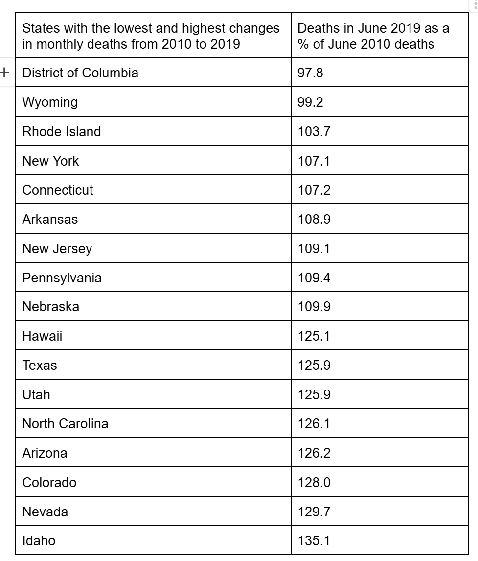
Trying to analyse mortality trends from 2018 to 2023 requires an understanding of underlying trends - population growth and aging all impact on deaths over time. Some states have the same mortality in 2019 as they did in 2010. This table gives the percentage of deaths in June 2019 as a percentage of June 2010 for the lowest and highest states. The difference ranges from a fall to a 35% increase in 9 years. It is important to consider these trends when assessing excess mortality.
States with the lowest and highest changes in monthly deaths from 2010 to 2019
June is a low for deaths in the USA. One method of calculating an excess is to produce a baseline for how many deaths there would be over the year if every year was like June. Every year has an “excess” by that definition and it is these excesses that I have compared.
I took the June death figures for each state from 2010 to 2019 and produced a trendline. Using the equation of this line I calculated the monthly minimum baseline from 2010 to 2023. Deaths in excess of this baseline are excess deaths in the following analysis.
Here are some examples of the summer baseline and the actual total deaths.
Here is Colorado:
Here is California:
The % excess mortality is the blue line deaths over the orange line as a percentage of the orange line.
Why not whole years?
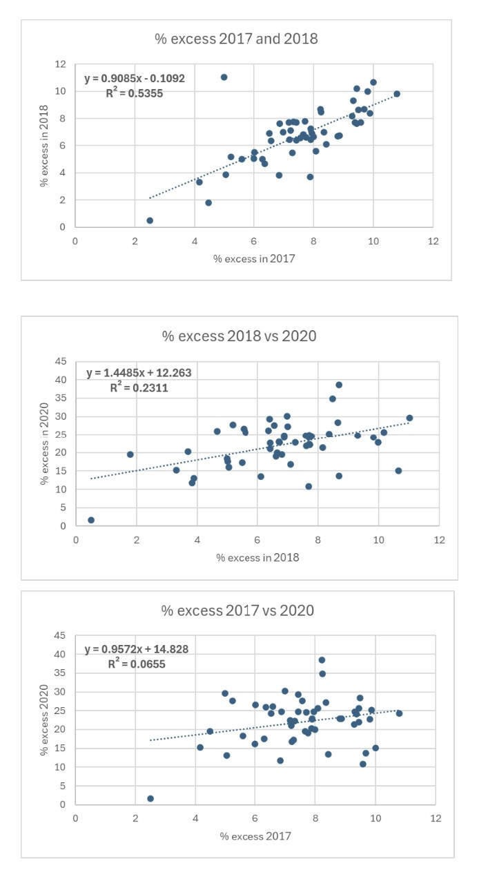
If we compare the whole year, what we see is a weak correlation where states that have more winter seasonal deaths are in the top right and those that have fewer are in the bottom left. This is a fairly uninteresting finding.
We can use it to show that 2017 and 2018 had high correlation for sequential years at around 54%. These were bad flu years. However, 2020 deaths had no significant correlation with these years suggesting that states with more winter death, more elderly and more frail were not the ones which had the worst 2020 mortality.
Why 6 month periods?
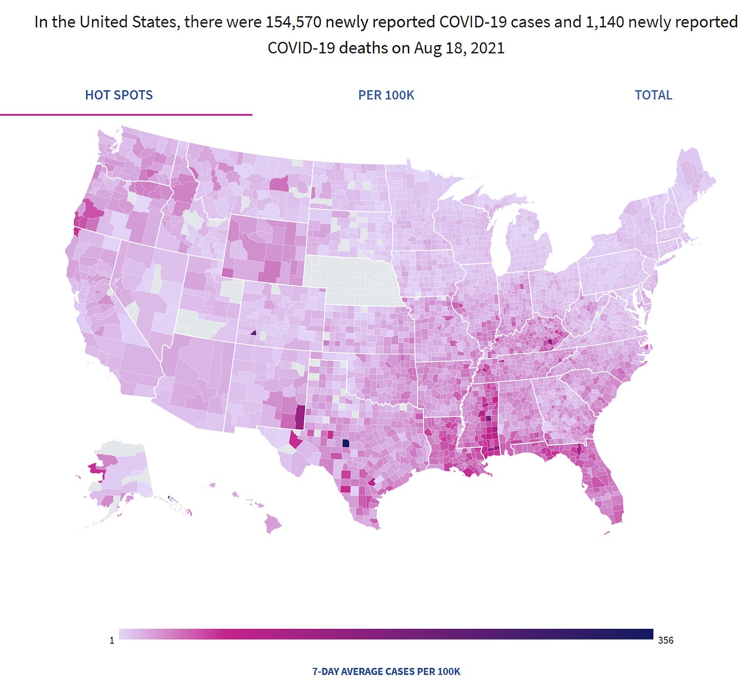
Covid demonstrated convincingly that the respiratory virus season is different in southern US states. Covid cases and deaths in summer 2020 and summer 2021 were disproportionately in southern states (see maps below). That pattern has repeated since.
Covid cases in preceding week USA: 18th August 2020
Covid cases in preceding week USA: 18th August 2021
Comparing sequential 6 month periods means comparing seasonal high periods with seasonal low periods. Some states have high and variable winter mortality and the factors that contribute to this variable excess are absent in summer. For others the same is true for summer excess compared to winter. Overall there should be no correlation between the first and second half of the year.
The additional advantage of comparing 6 month periods is it allows for more separating out the pre-vax period, the rollout period and the post-vax per-omicron period from the subsequent omicron period.
Terminology
The R-squared value is a measure of how well a line fits data. It’s expressed as a percentage and ranges from 0% (no fit - dots all over the place) to 100% (perfect fit - dots all on a line). It shows how much of the variation in one variable is explained by another.
When comparing state-level mortality rates over time in the U.S. Each dot represents a state: its mortality rate in an earlier period (x-axis) and next period (y-axis). You draw a trend line to capture the overall pattern.
R-squared = 90%: The dots are tightly clustered around the line. This means 90% of the variation in the next period’s mortality rates is explained by this period’s rates. States with higher mortality this year are likely to have higher mortality next period —good for predictions.
R-squared = 50%: The dots are moderately spread out. Half of the variation in next period’s mortality rates can be predicted by this period’s rates.
R-squared = 20%: The dots are widely scattered. The relationship is weak, so predictions are unreliable.
The key is that the closer the dots are to the trendline, the higher the R-squared value and the better one period’s mortality predicts the next’s.
Think of it as a matching score. If it is low, that means factors that are randomly allocated between states are determining the excess. If it is high it means that there is a factor that is causing the excess which differs between states in a constant manner from one period to the next.
Results
The key point is that there was no relationship between sequential 6 month periods until recently and now it is a strong relationship.
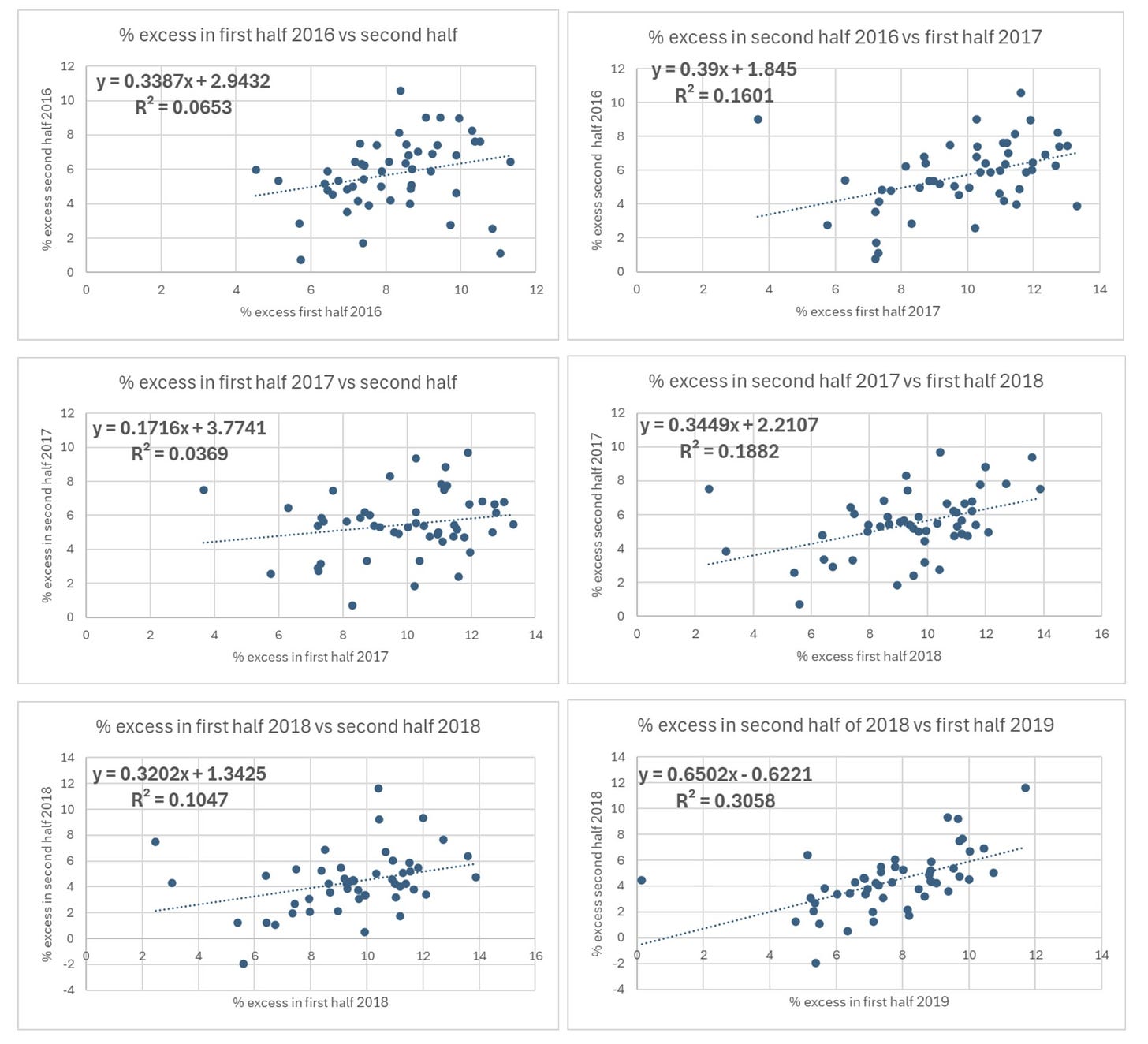
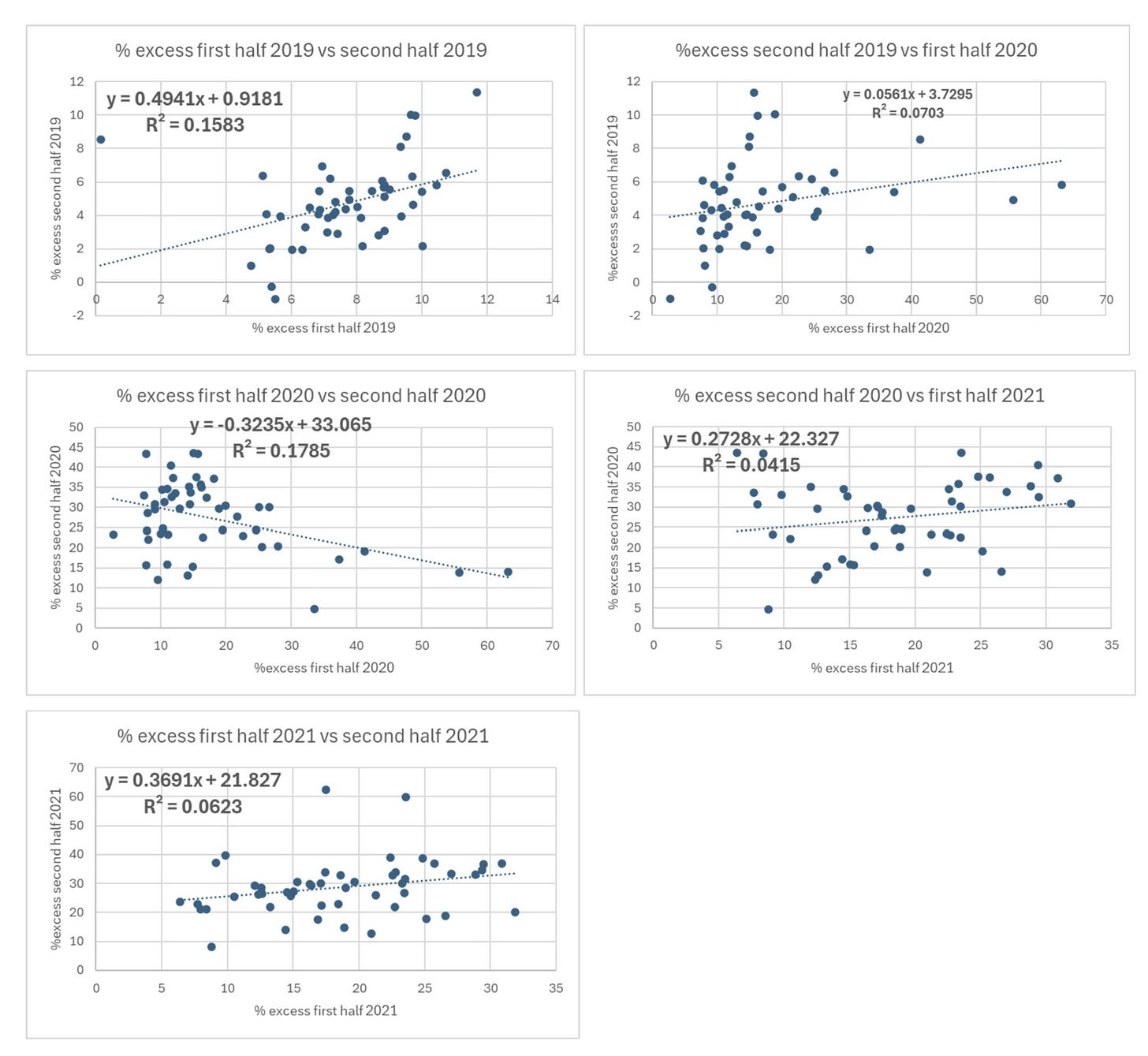
Here are the graphs in 6 month sequential periods showing how the dots representing the states start as a paint splat and then align closer and closer to the trendline.
N.B. When the R2 number is <0.2 it’s just noise. Even 0.3 is unlikely to be a genuine finding. When the R2 is low you can ignore the direction of the trendline - it is meaningless.
Look at the R2 values on these graphs. They are presented as decimals so 0.0653 means 6.53% of the variation in excess can be predicted from the previous 6 month excess.
This first set of graphs is the control group. It shows that there is no significant correlation from one 6 month period to the next.
The first 6:
Even with covid there is still no correlation:
So far, so boring. There is no relationship to sequential periods. Even the arrival of covid and lockdowns and the associated mortality did not produce a relationship. However, things change dramatically from this point.
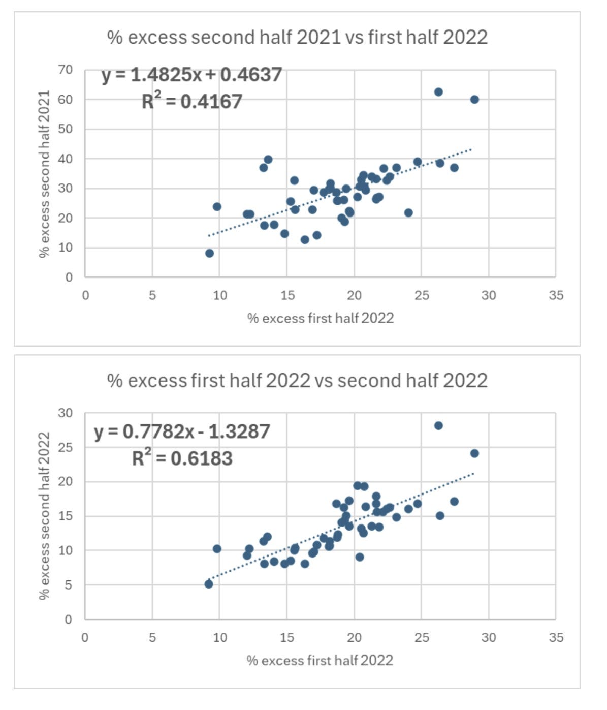
Even if you hate graphs you can easily see that the dots are much less scattered and start to sit really close to the line.
The R2 value is now about as high as they come in biology. If you were trying to predict the percentage excess in the second half of 2023 for each state, knowing the percentage excess in the first half of 2023 would allow you to explain 84% of the differences between states.
Something changed dramatically in 2021. The factors that caused excess mortality prior to 2021 randomly affected the different states and did not remain constant from one 6 month period to the next. However, from 2021 there was a factor that did remain constant over time. Here are the R2 values plotted over time (H1 = first half and H2 = second half).
The reason people died in the second half of 2021 is very strongly related to subsequent deaths. It seems something was introduced in 2021 that differed between states and is continuing to cause extra mortality. The differences no longer have separate seasonal causes - winter respiratory viruses and summer heatwaves. There is something causing the excess throughout the year.
Given that the vaccines were introduced in 2021, it is worth taking a closer look at whether the excess is related to vaccines.
In theory it could be the vaccine in more than one way:
The vaccine itself caused extra deaths
The vaccine prevented death and is continuing to prevent deaths in 2023 despite minimal covid attributed deaths
The second one stretches credulity as only a tiny fraction of the population remain unvaccinated so for them to be dying in excess in sufficient numbers to skew the relationship for the whole state would be impossible. There would be too much noise from variation in mortality in the majority vaccinated population to see such an effect.
Nevertheless, let’s keep an open mind and see if there is a relationship between the percentage of each state over 65 years old (and therefore at risk of a covid death) given 2 doses and the mortality.
To start with we can look at a control. This is the excess mortality in the last 6 months of 2020 (before the vaccine) plotted against the percentage of over 65 year olds vaccinated by the end of 2021 with 2 doses.
At first glance the downward trendline looks like the more vaccinated states had fewer deaths - but this was before anyone was injected! Furthermore, the R2 value is well under the level below which we are looking at just noise. This is what the vaccine needs to beat. (The outlier is Georgia with the lowest vaccination rate).
The first 6 months of the rollout saw no change. If the vaccine was saving lives we would expect the dots to be much closer to the line and for the line to become a steeper downward drop.
The second half of 2021 looks identical. It is ever so slightly steeper downwards but no statistician would claim this was meaningful.
When 2022 arrives, the slope gets less steep but even less statistically meaningful. This continues.
There is no evidence here of a vaccine benefit nor of the vaccine killing people.
It is perhaps most striking on the graphs below. The ranking of states by excess mortality barely changes from the first half to the second half of the year.
Here is first half 2023.
Here is second half 2023.
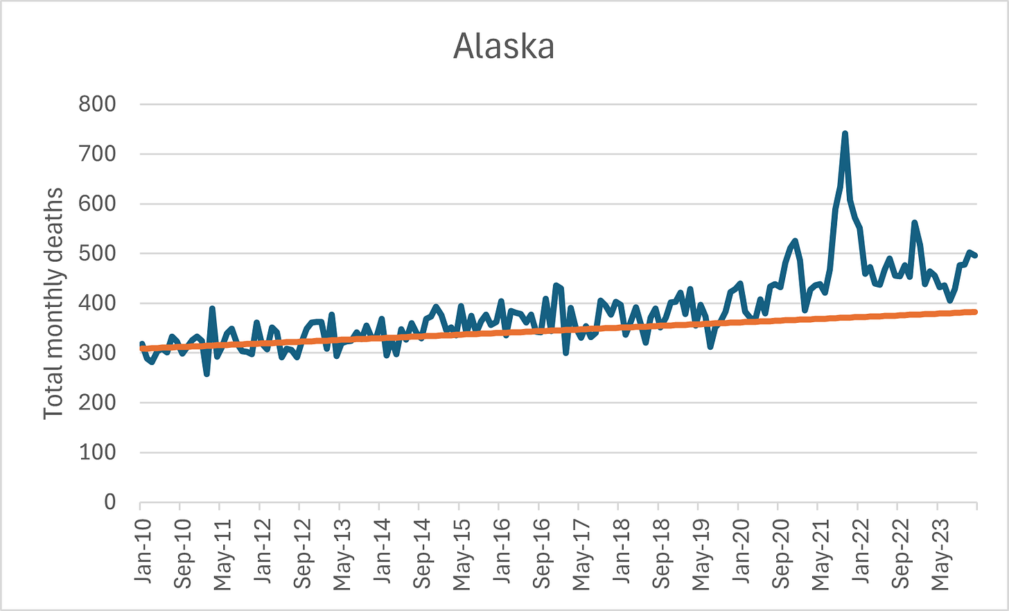
Wyoming and Alaska are doing particularly badly. These are both states which barely have any seasonal mortality so the June baseli not necessarily a low point for deaths.
Alaska:
Wyoming:
In contrast, here are the two lowest.
District of Columbia:
Massachusetts:
Discussion
Could this be covid?
If certain states were more susceptible to covid death then the correlations should begin from the second half of 2020 and should have diminished considerably by 2023 when only a tiny number of covid deaths were still being recorded.
Could this be healthcare denial?
The primary impact of healthcare denial was death during the period of lack of healthcare. However, future deaths are possible because of earlier diagnosis, particularly for cancer leading to improved survival.
Here is one estimate of the potential excess from delayed diagnosis. It makes generous assumptions that dementia deaths can be prevented and that intervention has a high impact on outcomes. Even then, and with a heavy bias to deaths in the immediate subsequent years, these extra deaths would only cause an excess of around 1%.
This small excess would need to be so differently allocated among states that there are some states hardly affected at all while others continue to see mortality close to 20% above summer baseline. This is a different measure - but given that Wyoming and Alaska have little seasonal mortality, any measure of excess is going to be similar.
Could it be the vaccine?
The quantity of vaccine given has no relation to the excess. However, there is good evidence that there were batch effects such that not all states would necessarily have been similarly affected, even when given the same number of injections. Given that the factor is having a marked impact on mortality, albeit in a geographically uneven way, and that the factor was introduced in 2021, the vaccine remains a strong possibility for the cause.
Conclusion
Something started killing people in 2021 at different rates in different states and those differences can still be seen in excess mortality in 2023
The number of over 65 year olds who were injected does not explain that finding
Either there is another factor introduced in 2021 continuing to cause this excess mortality or there was sufficient variation in the vaccination between states that the uptake percentage does not tell us how many were harmed.
Until someone can produce evidence of another factor introduced in 2021 that is causing excess mortality, the hypothesis that this was the result of the covid vaccines remains the strongest hypothesis.









Dr Craig, you are an amazing super sleuth. It is amazing and disheartening that those in authority and that have responsibility don’t care to know.
Thank you Dr. Craig - you're doing amazing work!
We got this!