

Removing the dying from the analysis
How do the healthy vaccinated compare to the unvaccinated?


N.B. The third part of this post was edited on 27th May to correct for me having use England and Wales data not England data for total deaths
The latest UKHSA data release shows the death rate of those vaccinated early on is stunning. Even the absolute numbers of deaths by the end of 2021 shows a marked spike before rollout into healthy populations. The graph below plots the number of deaths by the end of 2021 against the week that the first dose was received. These are not deaths that occurred within days - it is the whole year’s worth.
Absolute numbers of deaths over time

Figure 1: For each age group, the total number who had died by the end of 2021 is plotted against the week the first dose was given
After April 2021, there are sequential spikes as the rollout works its way through the age groups in healthy cohorts. Prior to April 2021, there were many more deaths by the end of 2021 because the dying were targeted for vaccination in that period.
The spikes in the profile are more to do with how many vaccines were given in any one week, which showed marked week to week variation.

Figure 2: Doses given by week to under 50 year olds
To account for that we can look at all deaths in 2021 as a function of the number vaccinated in that week - a 2021 mortality rate.

Figure 3: The 2021 mortality rate by week given first dose
There is a marked spike, peaking in the first week of February, which aligns in almost all age groups. It is followed by an odd plateau phase before the mortality falls away. By June the healthy 45-49 year olds have been vaccinated and the dying are again targeted.
Conclusion 1: The dying were vaccinated first. The ONS claim that the dying remained unvaccinated at the beginning of the rollout to the healthy cohort is incompatible with this finding.
Comparing deaths in prioritised groups with main rollout
By using a cut off of the end of April for under 40 year olds and the end of March for those in their 40s we can split out the already dying (prioritised) from the healthy (main rollout) in the analysis. There may well be a population of dying people who declined vaccination until the rollout for healthy people their age, but nevertheless there are notable differences between these groups that are worth considering.
The astute among you might have noticed the disproportionately high second peak in the youngest. Below are the deaths until the end of the reporting period for each cohort plotted by the week they were first injected.
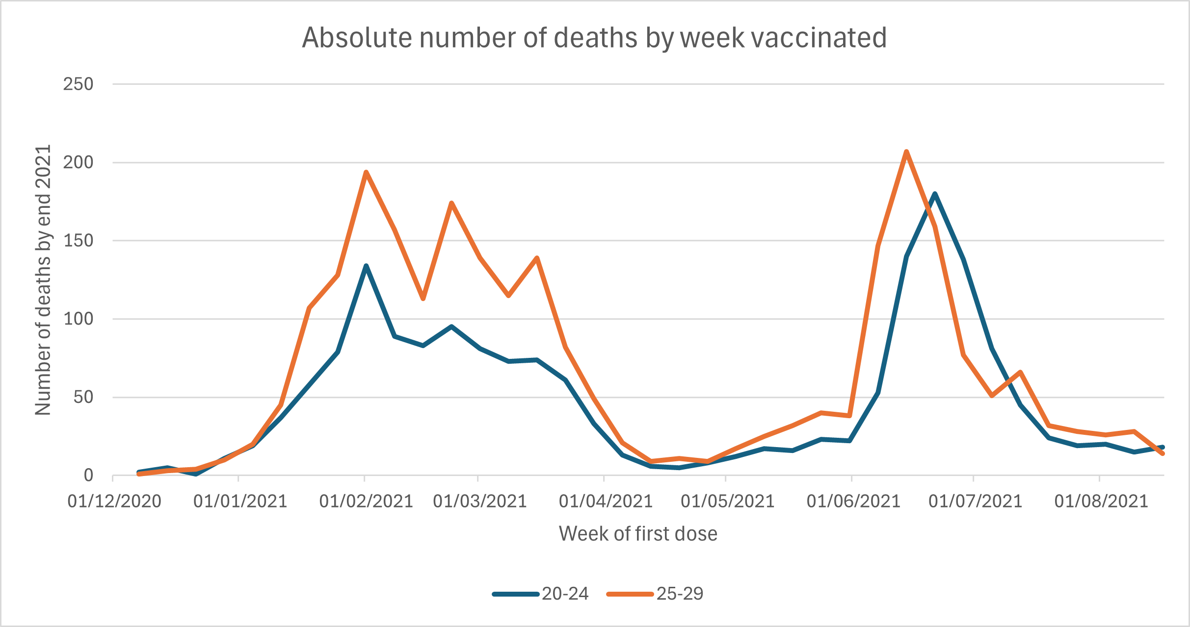
Figure 4: Total deaths by end of 2023 plotted by week of first dose in people in their 20s
If we use the end of April as a cutoff for the switch from prioritised and main rollout then we see that only half the vaccinated deaths among 20-24 year olds were in people who had been prioritised. For 25-29 year olds the figure was 57%. The table below shows the split for other age groups.

Table 1: Percentage of deaths in 2021 that were in group prioritised for vaccination using end April as cut off for under 40s and end March for 40-49 yr olds
A substantial part of this difference will be due to the differences in unexpected mortality by age. Around half of all deaths in people in their 20s are unexpected. However, that can’t explain the issue here. Nearly half of all deaths from May 2021 were in the unvaccinated in this period and we have to assume that a large proportion of those were unexpected deaths. Also, there were fewer months to die for those who waited for the rollout to healthy people in their 20s, in June. It is therefore quite concerning to see this high proportion of deaths in the healthy vaccinated population.
The problem here is not one of statistics. It was reflected by an increased mortality in 0-24 year olds in the second half of 2021, indicate there were indeed too many deaths.
Conclusion 2: There were disproportionately high deaths in the healthy cohorts in the youngest age groups.
Comparing the healthy vaccinated with the unvaccinated
By December 2021, 67% of 20-24 year olds had been vaccinated, according to UKHSA. We therefore might expect that the unexpected deaths would be divided roughly into two thirds in the vaccinated and one third in the unvaccinated. That is not what happened when comparing the UKHSA data with data on deaths by date of occurrence from ONS.

Figure 5: Monthly deaths by vaccination status among 20-24 year olds in 2021
By December 2021, a third of deaths were in the priority group, a third in the healthy rollout group and a third in the unvaccinated. That means the unvaccinated had twice the mortality rate of the healthy vaccinated. Either the unvaccinated led much more dangerous lives or else UKHSA has the denominator wrong. If there are more 20-24 year olds living here than registered in the UKHSA system, the unvaccinated mortality rate will be disproportionately high. (Only 5 out of 129 deaths registered in Dec 2021 were recorded as covid death in this age group).
The pattern is similar for other age groups but with an increasing proportion of vaccinated deaths being in the prioritised group.
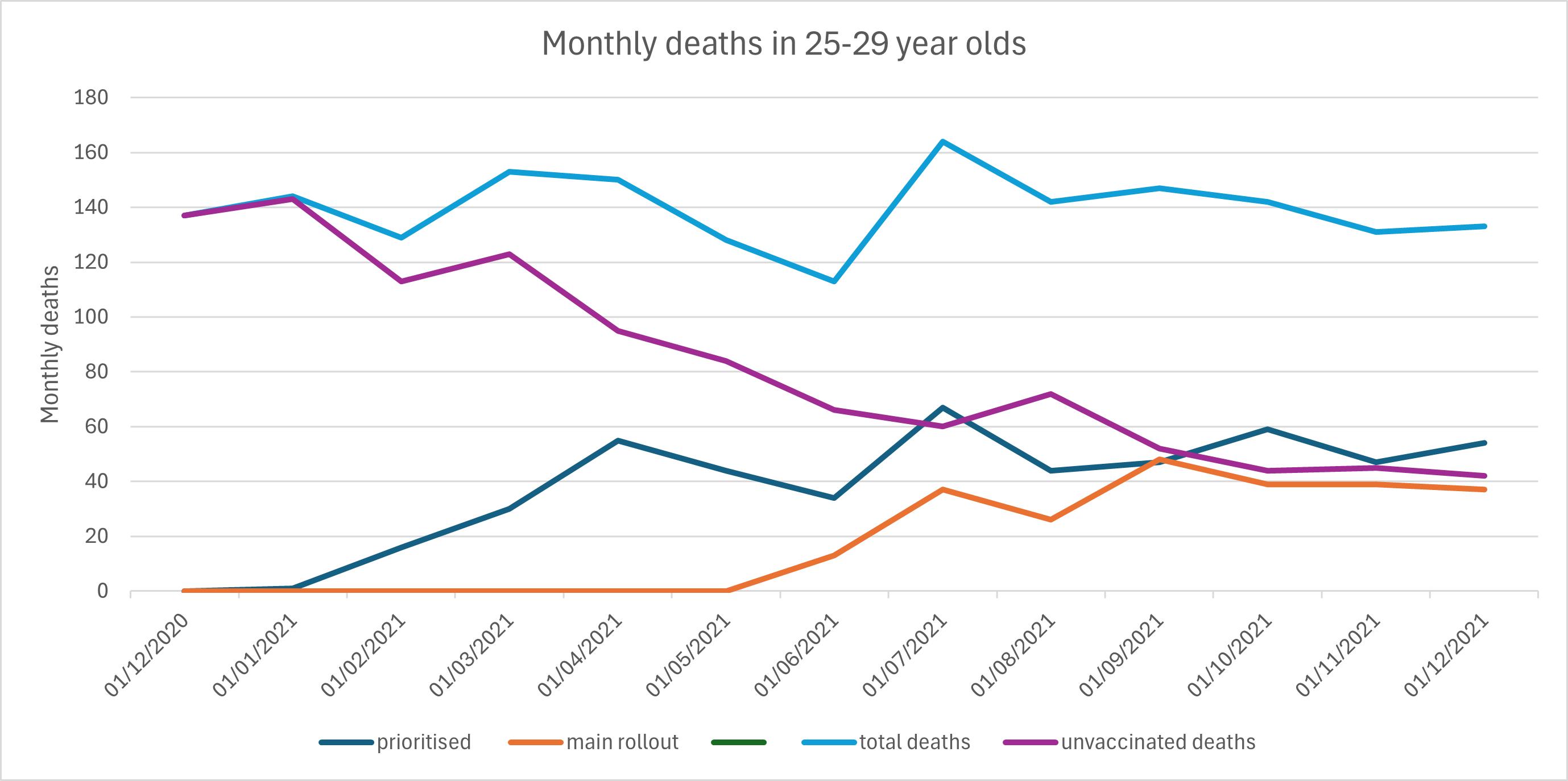
Figure 6: Monthly deaths by vaccination status among 25-29 year olds in 2021

Figure 7: Monthly deaths by vaccination status among 30-34 year olds in 2021
Figure 8: Monthly deaths by vaccination status among 35-39 year olds in 2021

Figure 9: Monthly deaths by vaccination status among 40-44 year olds in 2021
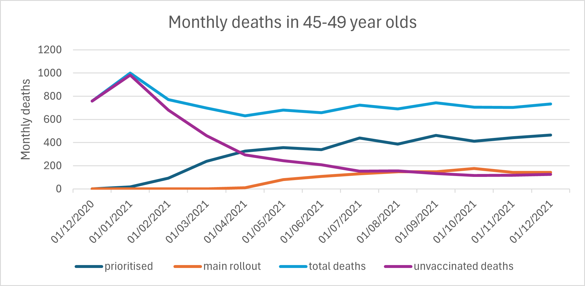
Figure 10: Monthly deaths by vaccination status among 45-49 year olds in 2021
The claim is that the unvaccinated have a mortality rate that is at least double the mortality rate in the healthy vaccinated population. For 35-39 year olds it is a farcical 4 times higher.

Table 2: The dying population who were vaccinated early were excluded, the rates of deaths in December 2021 are compared in the unvaccinated and the healthy vaccinated and the ratio of unvaccinated mortality to the healthy vaccinated mortality
Even if we make the extreme assumption that all the covid deaths were correctly attributed and none occurred in the healthy vaccinated, the mortality rate remains two times higher.
Conclusion 3: There are three possible reasons for these anomalies. Either there has been misclassification of death by vaccination status, for example a failure to record or match a record such that vaccinated deaths have been described as unvaccinated. Or there has been a significant underestimate in the size of the population in these age groups such that the denominator for the mortality rate is too small. The third possibility is that both of these errors has occurred.
Thank you Dr Clare for analysing what are crazy figures. For me it highlights how few of us said NO. Maybe 13m in the UK? That leaves a huge vulnerable population facing an uncertain unhealthy future with too few of us left to do the caring while surviving ourselves. 😞
My local once thriving market towns are already ghost towns with boarded up shops, out of town and online shopping plus high business rates. A small taste of what's to come as population inevitably crashes from these poisons.
So what Clare is saying in a very polite way is this
They are lying
We know they are lying
They know that we know they are lying
Yet they continue to lie.