
Where did the dead go?
Where did the dead go?
And where is the healthy vaccinee effect now?

For this first analysis of the UKHSA data from England, I am going to keep things simple and look only at deaths in the over 80s.
There is data for deaths up to the end of 2023, but for this analysis I am going to focus only on those who died in 2021.
Here is a graph showing the week the first dose of vaccine was received and the percentage of the people vaccinated who had died by the end of the year. The data on the numbers vaccinated was taken from the first NIMS (the vaccination database) release on 15th April 2021. Thereafter, people are removed from the data having died so it is impossible to know how many were vaccinated each week - some weeks look negative!
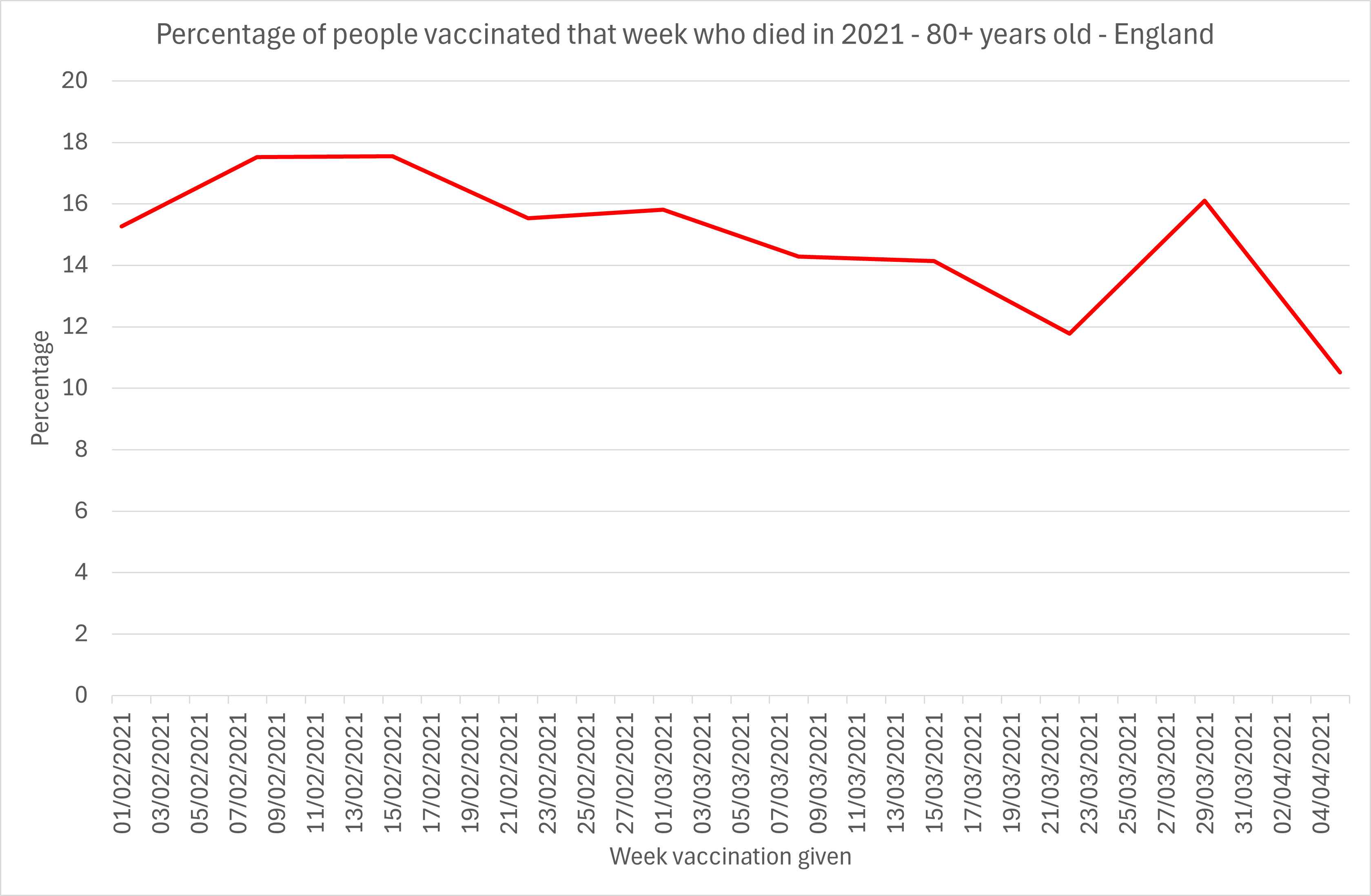
Figure 1: Percentage of those over 80 years vaccinated after Feburary 2021 who had died by end of 2021
In February, the mortality for 2021 peaked at nearly 18%. For those vaccinated later on there was less time left to die so the mortality falls gently away. By the time March arrives there are very few being vaccinated and the data becomes a but noisy and less accurate.
Now let’s speculate as to what the mortality rate in January would look like. There are several factors at play:
There was a high mortality in this age group in January, peaking the week of 18th.
By 8th February 93% of the care home population had been vaccinated,up from 10% on 10th January. Care home residents have a disproportionately high mortality, so the weeks when they were vaccinated would be expected to have a high mortality rate.
There are more months left to die, so the rate should be higher than in February or March.
Here is what it looks like.
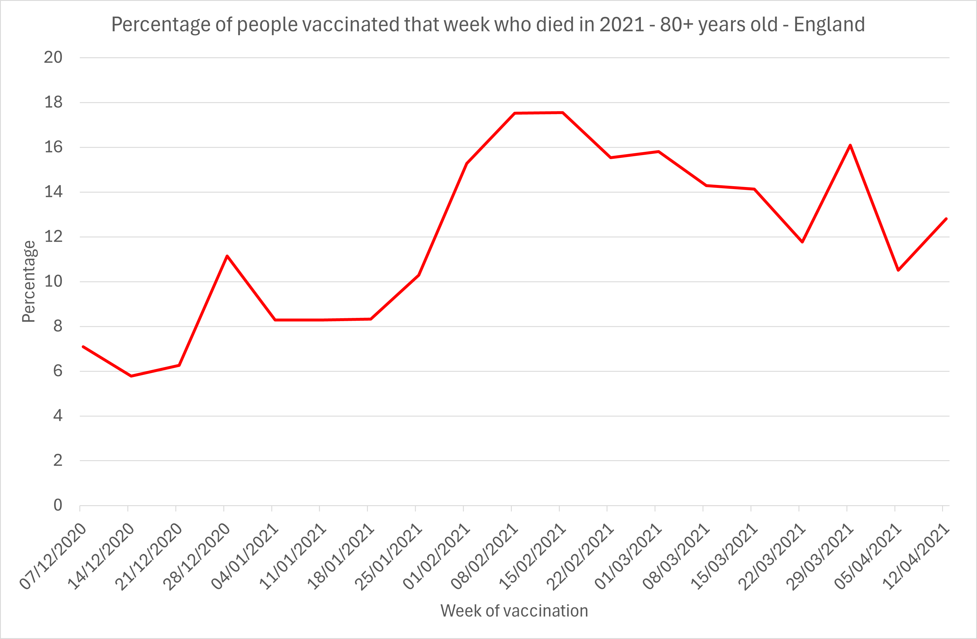
Figure 2: Percentage of those over 80 years vaccinated since December 2020 who had died by end of 2021
The mortality was half!
There are a number of possible ways to explain this:
The people not vaccinated until February were twice as likely to die as the care home population. Perhaps the only people over 80 still being vaccinated by February were being pressured to having been hospitalised.
The vaccine lots in use had a higher mortality rate later on.
The deaths that occurred earlier on are not included in the data.
The third hypothesis matches what Prof Norman Fenton, Prof Martin Neil, Joel Smalley, Josh Guetzkow, Scott MacLachlan, Jonathan Engler, Dan Russell and Jessica Rose have been writing about since 2021.

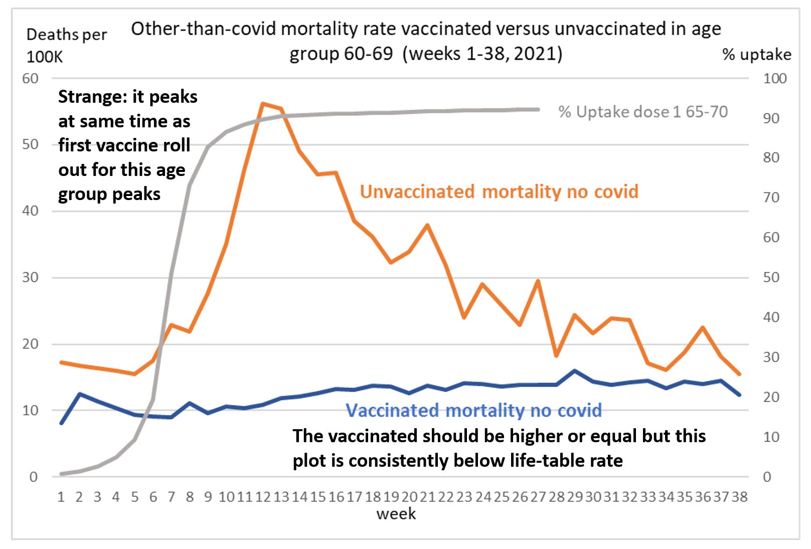
Figure 3: Mortality rate in vaccinated and unvaccinated population according to ONS
ONS have admitted it was an issue, but have assumed that it only amounted to ~2000 missing deaths.

Figure 4: Internal ONS email disclosed through Subject Access Request
A failure to properly record the vaccination status of the dying has had a huge impact on interpretation of vaccine safety. The fact is that at a country level mortality rose with vaccine rollout and HART have been calling this out since March 2021.
The ONS dismissed our concerns about misclassification by claiming that the dying were left unvaccinated and, because the size of the unvaccinated population was rapidly shrinking that created a very high mortality rate. This is referred to as the “healthy vaccinee effect”.
In reality, as everyone knows, the vaccines were targetted first at those who were at most risk of dying. Cancer patients were targeted, hospice patients were targeted, hospital inpatients were targeted. The claim that it was the healthy that were vaccinated first is simply not credible.
The lack of healthy vaccinee effect is clear in other age groups too and I’ll write about that next.
Healthy vaccinee bias exists in the U.S. county level data (which does not rely on cross-categorization between the CDC and hospitals or care homes where most people die), but it is nowhere near the level that would explain the miscategorization bias, which was clearly used to create a false appearancy of vaccine effectiveness.
https://www.campfire.wiki/doku.php?id=rounding_the_earth:the_vaccine_wars#vaccine_efficacy_effectiveness
Stats can be changed to fit any criteria or outcome. I just can’t believe a lot of findings anymore unless I know the principals or who is paying for the study. Even FBI stats are skewed to fit whatever grant they are searching for. I’ve seen it and I’ve become so jaded.