

The dying were first in line
By April the dying had almost all been vaccinated


The ONS have argued for years that the massive spike in unvaccinated mortality with vaccine rollout was because the dying declined the vaccines.
The truth is that the dying had already been injected.
Let’s start with the youngest age group.
The graph below does not show deaths over time. Instead each week along the x-axis is the week of vaccination. For each cohort vaccinated the number of deaths by the end of 2021 is taken. These deaths are then divided by the number of people vaccinated that week. The result is a mortality rate for the remaining months of the year. What the graph indicates is the risk of dying by week of vaccination. There were huge swings in this risk suggesting a difference in the makeup of the cohort being vaccinated over time.

Figure 1: Mortality by end of 2021 for people aged under 50 plotted by the week they received a first dose
At first glance there is a spike in mortality which begins shortly after AstraZeneca is rolled out at the beginning of January, however it falls away soon after and long before the first stories of deaths from vaccine had widespread coverage. The data from other age groups also indicate that this was not due to AstraZeneca rollout as we shall see.
In December and January, health and social care workers were prioritised for vaccination and the mortality rate for that year remained low. Shortly thereafter the priority became those most at risk of dying, hence the higher 2021 mortality. By the time the vaccines were rolled out for heathy younger groups, from May, the dying had already been injected.
The same pattern is seen in older age groups.
Targeting of the dying in spring 2021, with a high proportion dead by the end of the year
Rollout to the healthy with a low proportion who then die
Targeting the dying again, perhaps pressuring those declined vaccinations if they then become ill or are admitted to hospital
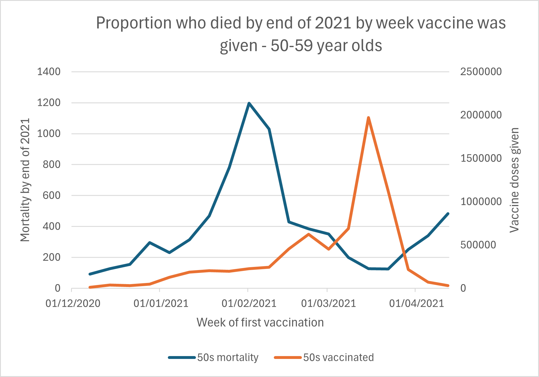
Figure 2: Mortality by end of 2021 for people aged 50-59 years plotted by the week they received a first dose and vaccine doses given
(I have used NIMS data from the first release on 15th April 2021).

Figure 3: Mortality by end of 2021 for people aged 60-69 years plotted by the week they received a first dose and vaccine doses given

Figure 4: Mortality by end of 2021 for people aged 70-79 years plotted by the week they received a first dose and vaccine doses given
The ONS is left with a dilemma here. Do they come up with some other reason for these peaks in mortality, which presumably would have to be based around problematic batches. Or do they admit that the dying were not left unvaccinated as they have previously claimed. If they admit the latter then their reasoning for the spike in mortality seen in the unvaccinated with vaccine rollout disappears.
This is exactly the kind of data that a proper Covid 19 should be taking a long hard look at. Instead we have an inept chair who set the terms of reference to all be based on a flawed assumption that NPI's were a proven and correct approach, backed up by a swarmy lawyer who covertly tries to ridicule those that rightly challenge that stupid narrative.
Thanks Clare. However I’m struggling to interpret the graphs. Can you please unpack your interpretation a bit to make the conclusions and assumptions clearer? Also, it’s not clear how a mortality ‘rate’ is involved (eg in the first graph) when only a number is given on the vertical axis: how is it a ‘rate’? Thanks.